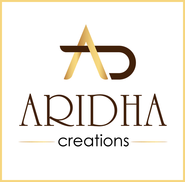
Project Name : Aridha Creations
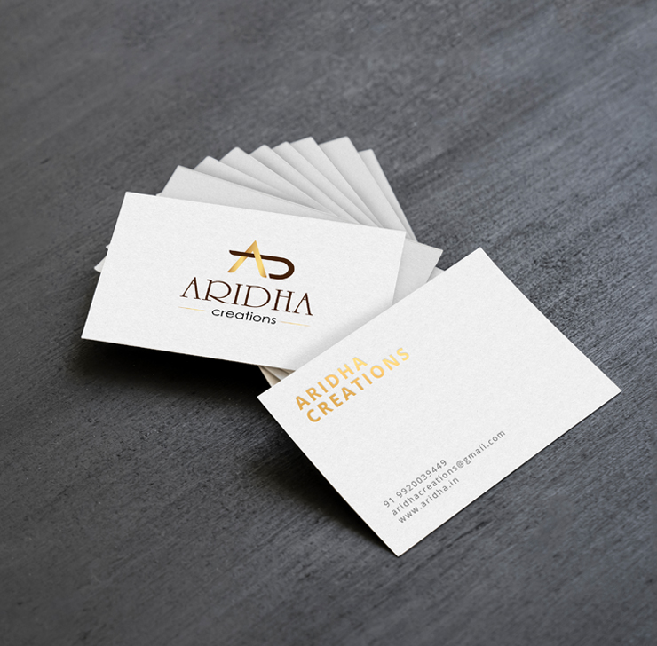

Aridha is a Mumbai based clothing brand that focuses on trendy Indian contemporary wear. The brands main inspiration for this is the Indian culture. The high quality materials are sourced from artisans around the world and produced in high-end factories in Mumbai.
An Aridha woman is sophisticated, strong and fun. To embody these qualities, the identity relies heavily upon a gold color palette, pulled from the stripes of a fabric used in the very first collection.
The logo and business card was created using the golden ratio to maintain the balance, order and harmony. Currently their website is under construction.
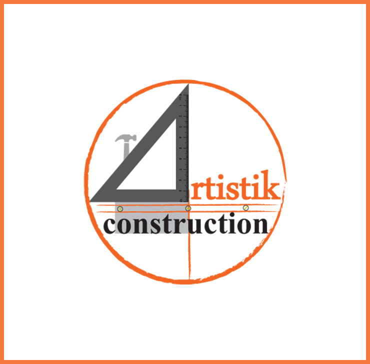
Project Name : Artistik Construction
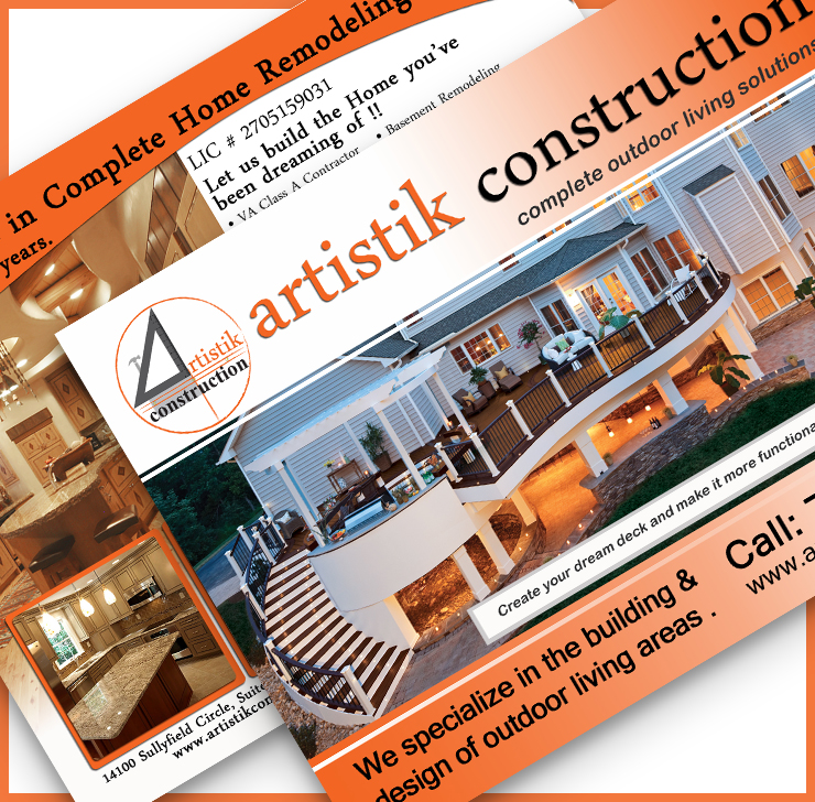
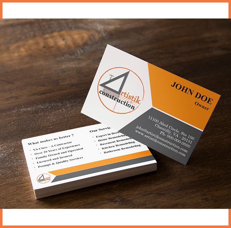


Artistik Construction is a trusted, professional, and knowledgeable contracting company servicing the Northern Virginia. The company has been operating with 20 years of experience and bring a team like approach to each and every job it does regardless of size or scope.
The logo was designed around the company’s core brand value of giving a memorable and unique experience to each customer. The color orange stands out as a symbol of creativity and joy and encourages emotional energies of compassion, passion, happiness and understanding. The harmonious use of color, shapes and font in the logo display the unique values of the company. It enforces into their customers and employees to remember their beliefs in order to make an impactful impression.
The use of serif font carries a feeling of class, tradition and respect while demonstrating a trustworthy nature.Every piece of marketing material is designed keeping the core band value on mind.
Project Name : Magik Stones
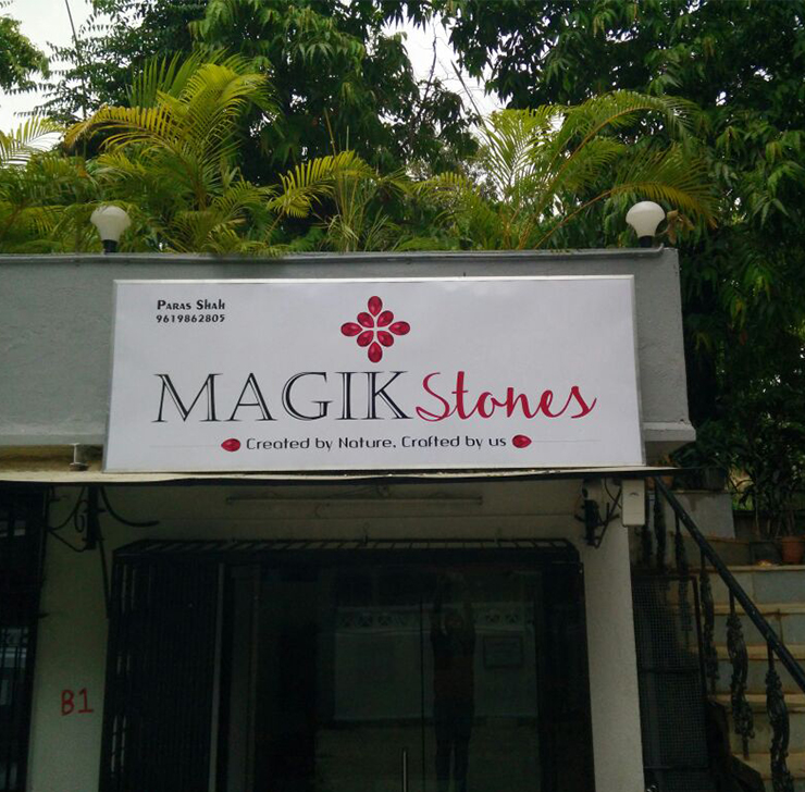
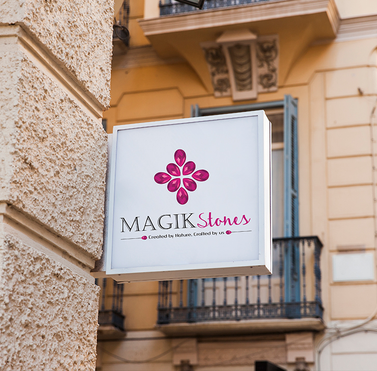
Magik stones is an acclaimed India-based precious and semi-precious gem stones dealer driven by luxurious materials and innovative one of a kind design. The studio explores and experiments with new techniques and materials, pushing the boundaries of Indian-made, extravagant gem stone jewelry.
Interpreting the seamless combination of the various materials and handicraft used to produce each piece, the logo comprises of two different typefaces that come together to form the logotype.
The visual identity aims to capture the modern and elevated nature of Magik stones hand crafted jewelry.
Project Name : Lasya Academy
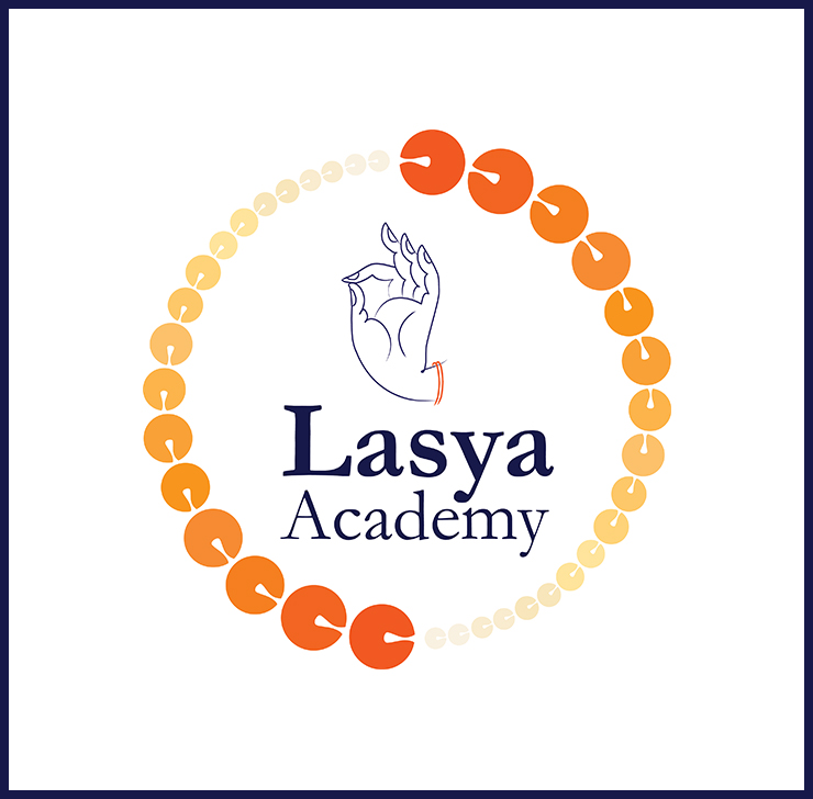
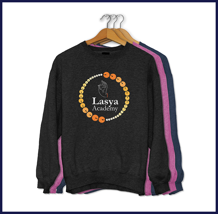
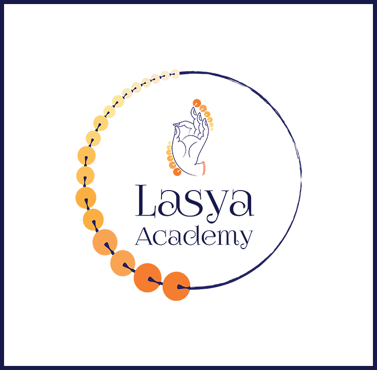
Lasya Academy is a Fairfax, Virginia based classical dance academy. With the aim to strength the awareness of Indian classical dance forms in the Metro Dc area and to healthy-fi your mind, body and soul.
The visual identity aims to interpret the various stories dancers tell through their hand movements and footwork depicted with ghunghroos. The colors chosen golden yellow and navy blue from the key colors depicting the vibrant and gender neutral dance style.
Project Name : Mop & Broom
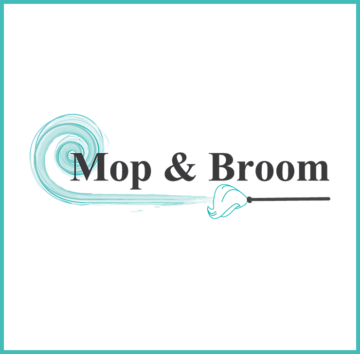


Mop & Broom an Ashburn based cleaning service company approached me to redesign their logo maintaining their original name format and give them a fresh new look.
The new makeover was designed to be up-to-date, vibrant and aiming for today's audiences. The fresh design and a new color palette made a positive impact on Mop & Broom employees and generated growth in their business.
Project Name : Breeze Painting LLC
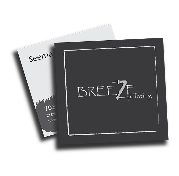


Breeze painting is a DC based painting company, delivering quality with certainty. The company required a new logo and marketing strategy. The voice of the company being modern and contemporary the new print material was created keeping the voice and tone of the company n mind.